|
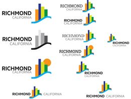
| Over the last couple of days, I have gotten well over 100 comments from people who read the logo presentation on TOM BUTT E-FORUM, Facebook or Nextdoor, and I thank all those of you who responded for your comments. These are copied into the table below. One thing for sure, Richmonders are fickle.
As for the logos presented, there was clearly no consensus, but No. 6, below, had more first place votes than any other.
This is a variation by North Star of a concept we suggested, below, that is based on an actual photograph looking from Richmond west towards the Golden Gate Bridge.
We have to figure out where to go from here. Some want us to start all over. Others want us to retain a different graphic artist, hire them to do the job or have a competition. All of these cost money we don’t have. They also take time, and we have been at this for two years already. Maybe Richmond doesn’t really need a branding and marketing campaign – for better or worse, we are what we are, take it or leave it.
It was such indecision that resulted in the City Council abandoning the effort in 2009 (see Richmond Branding and Marketing Plan, March 11, 2015, for history of that doomed initiative.
Two days later, in a Thursday morning talk show, KGO’s Brian Copeland spent an hour trashing Richmond and encouraging even reluctant callers to do likewise. Copeland’s theme was questioning why a city with “the highest murder rate in California” should be spending $87,000 on a branding campaign. Brian argued, “Richmond city leaders will spend up to $87,000 to develop a new logo and message intended to boost the city's image. Could the money be better spent? Is there a better way to enhance Richmond's image?”
The 2009 talk show fallout and the fact that numerous public relations consultants and graphic artists offered to do the job better and cheaper caused the City Council to quickly scuttle the effort.
What I have learned from this process is that a marketing and branding effort cannot, by itself, change the negative perceptions of a city, but it can reinforce the positive perceptions and thereby change the image people have of Richmond.
What we have also learned from the market research is that people both inside and outside Richmond typically associate Richmond negatively with, among other things, crime, blight, poor schools and Chevron. When I went on KRON4 to talk about this in 2015
On the other hand, Richmond is positively associated with intangibles such as diversity, opportunity and affordability and with tangibles such as its waterfront, history, Rosie the Riveter, proximity to the greater Bay Area and access to transportation. It is the positive associations that a branding and marketing campaign has to focus on to be successful. Tangibles are much easier to convey graphically than intangibles. It’s hard to depict “affordability” graphically in a compelling manner, but it’s much easier to convey “waterfront,” something we and others value but most outsiders don’t know about. That’s’ how we can change an image positively.
If a logo is conceived simply as a piece of art, messages don’t matter; the piece stands on its own, and you could hang it in an art gallery. But it doesn’t say anything except that the City has access to good graphic artists. On the other hand, if a logo is intended to send or reinforce a message, the message has to be selected, and the logo has to convey that message.
You really need to read the Richmond Research Report to understand what message a logo for Richmond needs to convey.
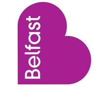
One critic pointed us to a website of a graphic artist who has selected what he believes are the world’s ten best city logos. Belfast (below) is his number one. It is simple and artistically pleasing, which is what graphic artists like. But does it say anything? If you have to have someone explain it to you, is it doing its job?
Starting off with the capital of Northern Ireland, and I may be a bit biased, but I’m a big fan of the Belfast City logo design. Simple in its form, the heart symbol combines with the “B” in further branding campaigns with slogans such as “Be welcome”, “Be part of it” and “Be vibrant”. A city with a troubled past, this new identity aims to promote tourism and inward investment to show the rest of the world just how much it’s changed in the last few decades.
Without the detailed explanation, it’s hard to see how it conveys “a troubled past,” “inward investment,” and “changed in the last few decades.”
Some people thought the $100,000 contract with North Star was simply to design a logo. The Branding and Marketing initiative is much more than a logo and a strapline. The market research portion (Richmond Research Report) was about 60% of the contract and was objective, not subjective. It describes in detail Richmond as we and other perceive it, not how we would like it to be perceived.
Some of the things I have gleaned from the input include:
- Some people don’t like any of the logos or the strapline. They want us to start over. Some think they or someone else could do it better or do it cheaper, or both. Perhaps they are right.
- E-FORUM and Nextdoor subscribers typically have and are willing to share a preference, while Facebook commentators tend to be generally critical and want to argue with each other while steering us to other websites, other logos and principles of good logo design.
- Some want a competition, which could certainly happen without even an invitation from me. If you have a better idea, submit it. If it rocks, we will find some way to pay for it.
What do you think?
Logo Comments Compilation, January 15, 2017
Comment |
1st |
2nd |
3rd |
|
From TOM BUTT E-FORUM |
|
|
|
|
I like no. 6, and please do away with the phrase “City of Pride and Purpose”. |
6 |
|
|
|
I don't count, but I like Option 6 best.
Bay and Bridge very recognizable.
My 2 cents |
6 |
|
|
|
I like # 6.... It stands out to me.... |
6 |
|
|
|
My favorite logos: #4, 7 and 8. |
4 |
7 |
8 |
|
Our family's favorites are #4 and #7. They're clean, attractive, and showcase what we love most about the city. |
4 |
7 |
|
|
I vote for #5. Definitely most attractive to me. Most peaceful and expansive.
Apparently, we're not showing the town -- maybe it's not so attractive.
Richmond is the place, not the bridge, so those are out.
Also not the WWII ships or the views across the bay.
#5 seems more like a place in Richmond, though I confess I haven't seen it. |
5 |
|
|
|
Thanks for sending along. I will review and comment in detail after I read the report, etc. The logos are all very visually complicated images that will be difficult to reproduce and be very expensive to print for letterhead, cards, etc. I am attaching the idea we developed as a placeholder for the 2001 Richmond Gateway project. It’s a three color image that built upon the existing logo with the swoop/bird/wave thing, showing shoreline and water and a nod to the Homefront with the star and red, white and blue colors. The proposed tag line or strapline is okay. We were trying to highlight the people and neighborhoods. |
|
|
|
|
I like #'s 6 & 7 best. They show a beautiful skyline, a sunset, the bridge, and much water |
6 |
7 |
|
|
None of those logos turn my propeller! Have Jan Brown of Spokewise (Don Hardison's daughter) take a look at it . She did the original RMA/ROV logo which is better than the current logo. There has to be a better combination of all the illustrations waiting for discovery! |
|
|
|
|
What about a logo that includes our beautiful City Hall, Plaza and fountain? |
3 |
14 |
|
|
I prefer number 3, but I also like number 14. |
|
|
|
|
I prefer logo #5, the oval, but with the lettering from #4. |
5 |
|
|
|
Here are some thoughts. I love WW2 history and it's one of my favorite things about Richmond, but I wouldn't put the Red Oak on our logo. I would like to see more continuation of WW2 history in the public design/arts that people see when roaming the streets like Macdonald Ave, pointing to Red Oak and other historic features. I think the consensus is correct that the shoreline should be the focus. #6 is the most striking image to me. The oval frame like in #1 and the frame shape of #2 seem hokey. #4's frame shape is good. My ideal would be a combination of #4 and 6, with the art of 6 but the font (or something like the font) of #4. Between showing the Golden Gate and Richmond Bridge, GG is more compelling.
The beautiful, serene estuarial river with flat grasses around in #4 and #5 does not seem believable to people with already ingrained notions of Richmond-- isn't it polluted there?? But the tone of sunset is something all Californians can identify with, we can argue that the views from here are beautiful, the shoreline is good and people can believe that. A river isn't shoreline so the message gets interrupted. |
6 |
|
|
|
Holy crap that's a lotta concepts crammed into half a sentence!
[...], is a diverse community with a steel resolve so great ideas are fulfilled on the home front of the next greatest generation. |
|
|
|
|
I like 9 |
9 |
|
|
|
Thanks for circulating Tom and also thanks for pushing to make this branding effort happen. My personal opinion - I like very much the "strap line" - it makes crucial points about a bright future and what will lead the way. As far as the logo, however, I feel none of them give the sense of a smart, compassionate future. Hate to be critical but they all seem variations on corny and retro which seems to contradict the forward looking motto. I actually think several of the earlier studies were going in a better direction when they rely less on overly specific images. Also like the inclusion of the strap line. |
|
|
|
|
I think its a great idea to re-brand Richmond and I like "Bayfront. Homefront. Outfront."
I'm not crazy about any of the graphics but would suggest one showing that we are on the SF Bay, probably the one with the GG Bridge in the background and bird in foreground. This emphasizes how close in we are for commuters and also some of our scenic wonder (I live in Marina Bay). Although the shipyard is an important part of our history I don't think that we should emphasize the past but rather our future. I would vote for the one showing the Bay Bridge but the large brown mass (Treasure Island?) creates an unappealing suggestion. |
|
|
|
|
In terms of the strapline, I always thought something like:
The New East Bay Starts Here.
Or something like that would be more active and attractive. Something that has a story to it that you want to read. It calls for discovery. The other one just feels descriptive. And Home Front and Out Front are pretty ambiguous even as descriptors. |
|
|
|
|
Great logos are simple, versatile and memorable. They succinctly and viscerally communicate the essence/ core emotional value of who/what the logo represents. They easily reproduce well even in a one-color copy machine.
A simple google search will come up with the same tips.
http://justcreative.com/2009/07/27/what-makes-a-good-logo/
Most of what you present are too detailed. The illustrated ones are too elaborate. If you want boats or poppies in a waterway, go for more metaphorical style. (See https://www.google.com/search?q=metaphoric+logo+style&tbm=isch&tbo=u&source=univ&sa=X&ved=0ahUKEwid2JKSxsDRAhWIqlQKHea7BtsQsAQIIw&biw=1280&bih=657 for metaphorical logo examples. They are cleaner, simpler, more easily reproduced be it on paper, on the web, on teeshirts, mugs, etc…
Of your simpler cleaner options… 8, 11 and 12 look like clipart. (amateur)
The typeface in 9 is harsh and difficult to read.
So, of the bunch, I’d go for Option 10. It’s clean. The script is friendly, contemporary and contrasts well with the san serif humanistic typeface used for CALIFORNIA.
But it is stark. I’d play around with and simplify some of the other elements in other options…and perhaps add to the bird…
I’d have done better for much less money. LOL |
|
|
|
|
In order of preference:
#13
#6
#5
#7 |
13 |
6 |
5 |
|
I reluctantly vote for #1 because it reflects the beauty of Richmond. We have some of the best bay views in the bay area and not many people living outside of Richmond know that. Richmond also has the bay trail and Pt. Molate that provide visitors with the natural beauty of Richmond. The pictures of the ships just reinforce the image of Richmond as a dirty, industrial town and the graphic "Richmond" is uninspired and boring.
That said, I think that all of the Northstar examples are hackneyed at best. All of them are boring and uninspired. None of them reflect the vibrancy of Richmond's diverse population of artists, musicians, activists, innovators, etc. I have seen a million pictures of boats and bay vistas. Couldn't Northstar come up with something innovative? Something that reflects Richmond as leading the way in new green technology and real diversity would, in my mind, better reflect the best of the city. |
1 |
|
|
|
To be honest I don’t like any of the proposed logos but I think the ones with the ship have the most promise. I would ask the designer to simplify the ship so it’s a stronger image and find some other typeface — maybe something that suggests the shipyard era. The logos using the bridge might also work if the bridge is simplified; as they are now, you will undoubtedly get a lot of snickers about the island that looks like a pile of something unsavory. The rest of the logos look like stock images and represent nothing very specific about our city. And most of the typefaces are hard to read. I’m very disappointed with what your design vendor came up with. The logos look very unprofessional to me. |
|
|
|
|
To be honest, all of the logos leave me cold. They are too complex and say NOTHING. How about this one. Other than the distraction of the whirrlie crane it is clean, neat and says lots about Richmond. |
|
|
|
|
I like the option #6 logo... |
6 |
|
|
|
I really like logo #6. It shows the iconic Golden Gate we get to view from Richmond, a view that resonates with potential visitors. |
6 |
|
|
|
Number 6 |
6 |
|
|
|
I vote for the contents of #6 but think you can do better on the shape of the border. The 8-sided frame looks dated and not aesthetically clean.
All the images featured in #6 match better the view seen by folks on the trail in Marina Bay, which is the most popular portion of the Bay Trail traveled in Richmond. ( It would be interesting to perform a head count.)The drawing takes creative liberty by compressing all images together, but when people walk the Marina perimeter and look out over the bay they see and remember all these images:
1. SF & Marin landmass
2. Brooks Island
3. Golden Gate Bridge
4. Sunset and other cloud action moving in
5. Tidal shorebirds
All these items do not look crowded even with the wording included within the border. If you square the corners, #6 could be made into a postcard that we can mail. I have a lot of postcards from Hawaii in similar style, with or without a border.
Unique as they may be, the images of Red Rock, the San Rafael Bridge, and the Red Oak are not as popular and not as visible to foot travelers in Richmond. |
6 |
|
|
|
(1) The strapline is great!
(2) I'd like to see a graphic that can ONLY be Richmond - not some letters or a generic scene that could be practically anywhere. I vote for either: (a) something related to Rosie the Riveter or (b) draft graphic #2. |
2 |
|
|
|
I like #3 the best. I like the shape and daylight color as opposed to a romanticized sunset. I like the bridge and the suggestion of a connection to "the city" and the ship in the background suggesting commerce. |
3 |
|
|
|
My favorites of the logos proposed are #6 and #7. Richmond is prominant, nice font, good color contrast, peaceful scenes. |
6 |
7 |
|
|
I like number 7 logo because the composition is beautiful and subject matter points to peace. Richmond is rich because of its shoreline. |
7 |
|
|
|
I like the tag line, but the consensus in my household is that all the logos stink. Why not have a logo design competition? Open it up to a really broad audience. When New Zealand considered redesigning their flag, they got a ton of good ideas this way. |
|
|
|
|
My reactions to the logo proposals:
1 - My overall fav, including the somewhat quirky, scripty font, which is decidedly "out front." The graphic is splendid and employs a beautifully balanced composition to allude to Richmond's best features, both natural and human-made. It helps that the font is presented in blue, not black -- more unifying and less in your face.
2 - More conservative and not so pleasing to me. The art seems less graceful in its dog-tag frame with the boxy Cal Band font. I really don't like the name California presented as an abbreviation.
3 - This would do. Nice font and one that, I suspect, would be attractive to more people than the font in #1 -- although I personally like that first eclectic font. Is that a plover sitting on the type?
4 - A pretty graphic that doesn't communicate much specific to Richmond. Seems more appropriate for Vallejo's waterfront. There's that chunky Cal Band font again.
5 - Pretty graphic with pretty font, but you could swap the type for the name of any one of a number of bay cities with no love lost.
6 - Nice, very nice, though the colors strike me as sort of retro. Which is not necessarily a bad thing, except where's the "out front" part? Also, I really can't stand seeing the bottom of the R bumping up against the frame -- it looks like a mistake.
7 - Alright, but doesn't say a lot about Richmond, specifically. The bird partially out of the frame suggests an unboundedness that appeals to me. Something about this font feels queer -- I mean odd, not gay. I didn't put a straightedge to it to doublecheck, but I think the type is bent away from the curve of the oval frame above it. Creeps me out.
8 - Very little here with just one bird pooping on turn-of-the-(19th) century, bandstand type and a ribbon for no good reason.
9 - Worse, although the Cunard shipping line font is at least interesting. Couldn't understand what the C and a little piece of a meant till I got right on top of it.
10 - Looks like the logo for a waterfront timeshare property. Nothing to offend or interest anyone here.
11 - This fussy Victorian logo font would do well on the packaging of quality chocolates. I think those are swifts, not gulls.
12 - And this manly font would look fine on a beer bottle. Is that one bird at the end of the type falling out if the sky after being shot?
13 - Well-rendered graphic, but it's all past, no future. This should be on the stationary for the Red Oak. Pretty good accompanying font.
14 - Same here, except the font seems weak and overly sensitive.
15 - Perfect for a sports team. Doesn't represent MY Richmond.
In summary: #1, #3, #6 -- in that order. I think. Actually, from a distance, I may like #6 best, but ONLY after someone adjusts the type position. That no-leading look went out 20 years ago.
I want my Richmond T-shirt to look classy.
|
|
|
|
|
I prefer images 2 and 5
We want to emphasize the bay and shoreline.
No one outside of Richmond will know what the boat images are and it makes us look too industrial, an image we want to modernize. |
2 |
5 |
|
|
The phrase chosen is very good. I prefer Logo No. 1 followed by 2 and 3. The Red Oak Victory logos too narrow and, thus, inappropriate. |
1 |
2 |
3 |
|
Thank you for asking for input from Richmond residents - very kind of you. I prefer logo #6 because of the landscape, water and wildlife represented - key attributes of Richmond. My eye was immediately drawn to #6 because of the orange, sunset color - giving it a calm brightness that made me look at it before the others. However, for me - the winning feature of #6 is having the bridge in the background - pinpointing a geographic sense of where Richmond is located in the world, and connecting Richmond to the greater Bay Area. My vote is for #6!
The only other logo that competed was #7, which is very similar to #6, but lacks the beautiful bridge in the background - giving #7 a more generic placement in the world - it could be any lovely place. Admittedly, I much prefer the oval shape of #7, as opposed to the octagon shape of #6, but the content of #6 won me over... still voting for #6!
But, whichever one wins is okay. All of the logos have integrity, simplicity, and a powerful message. Congratulations on fantastic results! |
6 |
7 |
|
|
I like # 6 because: 1) it shows Richmond as part of the bay area 2) It indicates the natural seashore beauty but in context with bridges/bay area 3) the angular outline hints at the industrial-ness and not just a sentimental oval shape 4) sun rising= optimism and change 6) good colors
DEFInitely don't do the big ship ones. Way too one dimensional |
6 |
|
|
|
I see we no longer are the three "C " community having banished corruption from the perception equation. Chevron isn't leaving so it appears crime will be the next "C" to defuse. Public education is another huge negative over which I'm not sure we have much control. Otherwise it's clear we have not effectively marketed our 32 miles of shoreline. I believe marketing the shoreline is the plow blade to turn over a new leaf for Richmond. When I mention the shoreline and the bay trail to people from other communities they are stunned by the information. Crime is not the key, witness the boom in Oakland despite it being considered the areas most dangerous city. As a minor point a new logo prominently featuring the water is a positive idea. |
|
|
|
|
I like number 6, as it highlights the "industrial" aspect of the city and also the natural beauty. If the flying bird from #7 could be used instead of the feeding one, it would be more energetic.
2 and 3 are ok- but seem to focus too much on point Richmond - the nice thing about #6 is that we might be looking at the bridge from the annex or the north Richmond direction!
4 and 5 don't have enough commerce, and 13-15 are just not relevant to most residents- though I understand the love that some folks will show these ones.
8-12 are too much like sport logos. |
6 |
2 |
3 |
|
They did a great job! I like Nos. 1, 2, 3 in that order - wonderful! |
1 |
2 |
3 |
|
I like # 6 best, since it shows the bridge and a bird. |
6 |
|
|
|
I prefer #7. It does not make us be the little sisters hanging onto SF for our credibility. The flying bird shows our independence and ability to soar. |
7 |
|
|
|
Not sure how much of a voice I can add as an outsider, but somehow this issue triggered me and I wanted to share this TED talk with you: “Why city flags may be the worst-designed thing you've never noticed | Roman Mars” The SF city flag is heavily scrutinised in that video…I realise that a logo isn’t the same as a flag, but perhaps the whole marketing initiative will lead to a flag at some point and then it will probably build on the logo.
Personally, I find 8 and 9 horribly looking, in 9 you can’t even read the CA clearly. 10 looks like the Hollister, CA logo because of the bird. 11-15 are also bad.
I think that 2 is the best. It is straightforward, the bridge, shoreline and water looks nice. It could be both dusk or dawn and in pretty much any time now or in the future. (It doesn’t have too many colours, which will make it easier for printing.)
Good luck with it. Curious to hear how others will respond. |
2 |
|
|
|
Feedback on logo choices. I like #6 , incorporating the bridge, the shoreline with bird, the setting western sun, the colors, the font, only suggestion is an elliptical shape for the outside border. |
6 |
|
|
|
I have just reread what I've written.... I'll ask you to remember you did ask for feedback...I have been too blunt as usual , but I've spent enough time and thought on this and am not patient enough to go back and reword it. Please read it with that in mind and if you'd like to use any of what I've put forth I'm sure you can phrase it better.
As you know my profession for over 20 years was working in prepress and printing. There are, in my opinion some serious flaws in what has been presented from a graphics as well as printing point of view. The biggest problems I see with most of the choices they have presented is that reduced to the size that they will most often be printed or seen the fine line details and elements will be unrecognizable i.e.: the rigging and the name, Red Oak, East Brother etc. I think that most of the typeface choices hark back to 40's & 50's Industrial America and the shoreline and the 21st C. is what we should be promoting most. Here are my thoughts on the best choices.
#8 I like this the best, including the type but the white lines in the type will not read reduced to size. They should either outline the font in black and fill the type with a tint of same, or outline in black and make the space between the white lines a solid or a tint. I would also be concerned that the legs, beak and California type might not read well at a reduced size. I think they could solve those problems easily, but they should be discussed.
#3 I find the shape overly complicated an oval would suffice. It's too busy I would eliminate the bird and as mentioned at the most commonly used size the Lighthouse won't be recognizable. The font they keep using they clearly favor, but I think it's pretty bad, it looks like candy bar font...think Mars Bar. The only fonts they have presented that I like are #8 with corrections mentioned above, and #13 if it's on a slight curve.
#6 It's too busy eliminate the bird and the sun, simplify the shape to an oval. Maybe make it all in blues, not the brown & blue. Again the Mars Bar font.
Perhaps the graphic could combine some of the qualities and color of the sunset effect in #7.
Additional comments
The Brand Platform is terribly written. I read it three times and didn't understand it. Also what does "Out Front" mean?
Page 7 of the document shows some simple branding, the top 2 have wavy blue lines under Richmond If they were numbered consecutively left to right #2 & #3 are pleasing.
#2 I like the font but it does not say California anywhere and there is a tint? of something ? showing to the right of the birds breast...either make it clear or eliminate it. And change the bird to the egret shown in # 3.
#3 The shipping crane shape should be eliminated entirely it's very awkward looking, or redrawn so it reads better. I don't think you can have the bird and the crane elements it's too busy with both. The words "The City of" should either be eliminated or that font must change, it looks like a complete afterthought. The Richmond Ca font could also use some improvement but at least it isn't as bad a choice as most of the others they have selected/created.
What's that saying "Be careful what you ask for"? Best of luck ! |
|
|
|
|
Lots of good logos to choose from! I like two of them
Logo #6: My eye just kept getting drawn back to this one. I love the sunset from Richmond, it shows both land and water.
Logo #13: Shows connection to the WWII Home Front. Bigger letters for city are easier to read
***However, aren't colorful and complicated logos challenging to put on certain documents? Shouldn't we also have the black and white alternative next to the color, so we can really compare? Or maybe the final logo can be further divided to have some options. For example, the NPS has a black and white, and a 3D arrowhead |
6 |
13 |
|
#6 but with an oval border. It’s the most artistic of all the views. |
6 |
|
|
Sometimes it's necessary to spend a lot of money to know what you don't want - it doesn't necessarily say that it was wasted. But now that people are aware of what's happening, maybe those who are good at this sort of thing could try their hand, like Mindy did, of some suggestions. At least it would give us a better idea of what people tend to like or not like - have a no strings attached request for people to submit what they would like to see our logo look like. |
|
|
|
without disrespecting your suggestion, I want to reiterate that logos are difficult and an open call is not a professional way to accomplish this. Good design takes time, which is why good people get paid for their efforts and expertise. And yes, generally many rounds of trial and error need to happen to weed out what doesn't work. |
|
|
|
Of course - which is why I said it would be no strings attached, and MIGHT give us some idea of what kind of things people might like. |
|
|
|
From Facebook (Everybody’s Richmond, California, The REALRICH, Richmond CA, Tom Butt |
|
|
|
These all look corny and trite. Hire Spokewise, a talented Richmond graphic designer, Jan Brown, who created the Red Oak Victory logo among many others. |
|
|
|
Agree with _____, and "FrONT" as key slogan!? And this or 100k!? None of these logos transfer easy into small scale or black and white. Our town's streets are riled with potholes, unless you live in a privileged area... gun shots, drugsales and underage prostitution, Chevron's continued releases of harmful toxins are the real frontier. So, cant money be better used? General public is pretty smart in spotting discrepancies between PR slogans and bottom line business environments. Adressing those grievances residents repeatedly voice rather than ignoring them with a 'thick skin' mentality will be certainly more effective. |
|
|
|
They are definitely better than previous. But I tend to agree that they are a bit corny. The phrase doesn't really evoke much. I applaud the effort to get it done. Just wondering if $100k was spent to do the market study that resulted in this Mayor Tom Butt Tom Butt ? |
|
|
|
I'm surprised to hear all the negative comments. I was really impressed by these. What do I know though, I'm just an architect |
|
|
|
The visual design skills in architecture differ greatly from graphic design. When I took graphic design at City College, at first I was intimidated by classmates who had graduate degrees in fine arts and other art endeavors in which I had no skill or experience. Ended up that most of these folks did poorly at graphic design because graphic design is all about visual communication, minimizing visual presentation to an essential kernel of emotional value, not making pretty things. The fine arts folks had a difficult time minimizing, keeping things simple, finding that kernel of essence to visually communicate in a square inch. The students who did well often (like me) had no art background, but instead came from an editorial or writing background. Logos are to graphic design what headline writing is to articles/stories. It's difficult. The best look as though they were easy, fast to do, but they were not. So…you may be a great architect, but not necessarily a good graphic designer/graphic communicator. |
|
|
|
Not sure if ______was implying, incorrectly, that architects can design anything. Maybe many of them think that's the case because theirs is the only design profession that requires a license. Because a logo can't kill anyone if it collapses, I guess. |
|
|
|
Architects design ugly and poorly thought out things all the time... |
|
|
|
My comment was young in cheek. I realize architecture and graphic design are district and different skill sets. I do like to think I have a good design sensibility though. I work regularly with graphing designers including Jan Brown at Spokewise. Ultimately opinions tend to vary widely. I was impressed with these (and got to see the many unimpressive ones that preceded them) and was just honestly surprised of the degree to which others were not. In and case we all know why they say about opinions |
|
|
|
Some of these are on the right track, but overall the fonts are ... weak. |
|
|
|
Most of these violate principles of good logo design. A logo should be simple, versatile and memorable. It should succinctly communicate the core emotional value/essence of what it represents and reproduce well even with a one-color copy machine. Most of these are too elaborate. Illustrations are too detailed. Do you really need a boat, waterway, poppies…as I explain to my design clients, go for a metaphorical style logo. Cleaner, simpler, easily reproduced and memorable. Of these, I prefer 10. It's clean. The script typeface is friendly, contemporary. Contrasts well with the humanistic san serif typeface underneath for California, though I'm still not sold on it.. Typefaces in many of the other examples are too difficult to read, or have too harsh a feel. Read up on effective logo design, then evaluate these. https://www.smashingmagazine.com/.../vital-tips-for.../

Vital Tips For Effective Logo Design – Smashing Magazine
smashingmagazine.com |
|
|
|
|
|
|
|
Exactly, ______. A case could be made for improving upon what we had, an evolutionary change. Perhaps should have tweaked/refined this one…use more contemporary typeface and colors, make graphic more elegant, more minimal, that still communicates our core values. |
|
|
|
I hear you, and think this logo fits those substantive design elements. That said, I think it is a horrible logo. |
|
|
|
I agree. Horrible typeface selection. Clunky amateur graphic. That's not to say you couldn't morph it into something appropriate, effective and with the right look and feel. Maybe when I get home I'll play around and send you something for fun. |
|
|
|
I agree about the tagline. It's…awkward. In terms of the logos, the illustrative ones will be difficult to reproduce in many applications and also difficult to read from far away. These are some design basics that every graphic designer is taught. Most of the typography is "trendy" and not going to be enduring. They will look dated in 5-10 years, and a good logo (especially one that costs $100,000) should endure for much longer than that. Overall, this is a disappointing effort. I'd like to see something that is simpler, easier to read, classic and enduring.
Having said all that, if these are the choices, then #10 is the most successful, IMO. It stands out the most because of its boldness, and the typography is simple and somewhat classic. Perhaps the firm could do iterations on this one, with different type styles. |
|
|
|
I would lean on the side of finding an artist that can really take us into the future we are talking about. Not impressed. Out front should show up in the design |
|
|
|
I can design a good logo, and for a lot less than $100,000.  |
|
|
|
They should have done a. contest for Bay Area residents to participate. I bet we would have gotten some great stuff. |
|
|
|
My firm would have designed an amazing logo. I don't think all the money was spent on only the logo. There were the survey's, study sessions, exhaustive research across the globe to arrive at this, it's just okay. |
|
|
|
I have a niece that does good work. A young entreprenur. I'll send you a sample. |
|
|
|
I like #16. |
16 |
|
|
Wow, I would have expected better for $100k. I don't find any of these particularly memorable. Glad this wasn't taxpayer funded... |
|
|
|
I like the strap line, not loving the logos |
|
|
|
Tough crowd here.. Perhaps the 2 year input and discussion process was too short to allow consideration of all the great alternatives I'm sure you all must have been contributing... |
|
|
|
The efforts to do this were pretty insular. I never personally received a request to provide input. But I don't see why it would be necessarily requisite, if I knew smart people were earnestly working on it. Feedback is now being requested, we are giving it and you lob a snowball at people who are giving feedback for not being involved. |
|
|
|
Tough crowds shouldn't be so sensitive |
|
|
|
Sensitive? Are you talking about people giving their feedback or your sensitivity? |
|
|
|
I think the thoughtful opinions of people (those with design backgrounds and those without) who haven't been close to this project for the last two years and who are seeing it with fresh eyes are pretty valuable. A good design firm takes intelligent feedback with grace and doesn't get defensive. |
|
|
|
6 is okay, just change the shape to oval... |
6 |
|
|
I don't like "out front" in the strapline. It doesn't make sense without a long explanation, and a strapline should be able to stand alone. |
|
|
|
I don't really love the logos either. Here are some more specific comments:
-I like the idea of having a picture (but prefer the ones with wildlife instead of the ones with the bridge and ships). Although I'm not sure that the images work in a logo because it needs to be reproducible in black and white or at least grey scale.
-I agree that the font should be carefully chosen because the word "Richmond" in that font should be recognizable as a logo with or without the rest of it. |
|
|
|
OK, full disclosure: I graduated with a BA in Graphic Design from Art Center College of Design. I have worked for some of the top design and branding firms in the world (Landor, Gensler). I've contributed to design of logos for companies such as Chevron, KFC, HP, BP, Chevys and Haagen Dazs. So while my opinion is my own, and no, I have not been contributing to this project for the last two years, I didn't just fall off the turnip truck. I hope the mayor and other decision makers on this project will take thoughtful feedback from design professionals with that in mind.
In my informed and educated opinion, these designs are not appropriate for a city like Richmond that aspires to be world-class and "Out Front." Most of them are attractive, but they look to be for a different kind of client. A restaurant, or a brewery, or a high-end store in Mendocino. They are too illustrative in style to be practical for the multiple uses that will be required, both in terms of size, materials, and context (newspaper vs web vs signage, etc etc.) They are also somewhat trendy in their design, and will appear dated in 5-10 years, which is not the kind of shelf life that one should expect for a logo and brand that cost $100,000.
What you should receive for that kind of money is a design that is not only classic and enduring, but also practical. Most clients also will need multiple versions of their logo, for multiple kinds of uses. Vertical vs horizontal format, for example. Or a non-gray scale version for use in black and white. Perhaps this is part of the next phase of design, so here I'll give the benefit of the doubt. |
|
|
|
Well said. I feel like I'm looking at the logos of an outdoor company or a line of luggage. |
|
|
|
You can google and find these on line |
|
|
|
I like 15. From my 2 years of being here and the bit of history I know of Richmond, I think it does represent our city well. I would just lighten it up a bit. Looks under exposed in some areas. Other than that I like it! |
15 |
|
|
My vote is for 3, 6, and 13 |
3 |
6 |
13 |
I think they are all too calm and pretty for a strong proud city with industrial roots and Rosie the Riveter. 8-12 look like baseball team logos. |
|
|
|
And, tell me again what 'out front' is supposed to mean?! |
|
|
|
Progressive |
|
|
|
Maybe it should say that! |
|
|
|
3 or 6. guess I like that font the best. |
3 |
6 |
|
Agree with ________ design rules..., UC Berkeley taught me the same principles. Say it once but say it really right. These admittingly very pretty event logos are too ventriloquist and don't serve the purpose as image changers. Regarding the motto, the existing one seems to work just fine in catching the essence. It also is a constant cause for outsiders to smile once they have the opportunity to engage in one of our spirited, at times a bit too rude, conversations. |
|
|
|
Brainstorming tag lines. I’m looking for ways to emphasize the future of Richmond, while respecting that we stand on the shoulders of a remarkable past. Not saying these are good, just what comes to mind, for what it’s worth. Some are a bit tongue in cheek, but like I said, brainstorm...
Rooted in Resilience. Rising in Renewal.
Promise. Pride. Purpose. (with a nod to our current tag)
Rooted. Rising. Resilient.
Growing, Green & Groovy.
And of course, “Makes its own rules.” (not mine)
About the graphic—Our industrial and scenic waterfront is a great asset and important part of our past and future. But is there a way to look inward toward the rest of the city and the amazing developments and potential in urban agriculture, youth entrepreneurialism, and the future of new green industries? (the “rooted” is important to me for this). |
|
|
|
Wow, ________. That's a lot to ask for a logo. A logo's purpose isn't so much to tell a story as it is to evoke a feeling behind the story. In a square inch or smaller, tell how you want viewers to feel. I'm afraid showing something looking inward towards a city, urban agriculture, entrereneurialism… would make for a very busy if not useless graphic. But, if you can parse all that into a few words that describe how you want us to feel, a visual communicator/graphic designer could work with that to combine typeface, color palette, graphic elements in a way that evokes that. |
|
|
|
Thanks _____. I'm more interested in the tag line or "wrap line". I just wish that the logo could portray more than just waterfront icons. |
|
|
|
Almost Marin. |
|
|
|
Better than Bolinas |
|
|
|
Good alliteration. But I like Bolinas, so not sure that we're better... Just different. |
|
|
|
Just a simple Google search illustrates the possibilities
https://www.google.com/.../21-best-contemporary.../amp/...
21 Best Contemporary Worldwide City Logo Designs - DzineBlog.com
dzineblog.com |
|
|
|
Thanks for sharing that. Prospective is everything |
|
|
|
Good examples. Each worked off the old, but simplified and cleaned them up. Made more contemporary |
|
|
|
Wow, some of those are downright beautiful. |
|
|
|
Designing an effective logo is darn hard. That said - neither the tag line or any of these designs work better than what we already have. Not that Richmond shouldn't update its brand but it needs to be an improvement.
Good design advise has already been given in several comments - needs to work on a wide variety of sizes and applications, translate into both black and white and color. Convey symbolic essence, graphically and with font choice. What I feel here is a lack of clarity, which may accurately reflect Richmond's current state, but that isn't something we should be advertising.
The tag line, for instance, has got three separate ideas - location, history, future. Too much. Simplified might be "Bay Front Out Front". Don't think that's great, just trying to get my point across.
The logos are, as Catherine Montalbo said, wrong for this application. The scripts look like they belong on baseball jackets. The illustrations are too fussy and don't read well reduced. Without the illustrations they're not at all interesting. The boat, well, that is just not the least bit forward thinking.
This sounds pretty harsh, but I don't see any point in sugar coating. We shouldn't be adopting any of these. Plus it appears that whoever is coming up with designs doesn't have a good sense of what this logo needs to convey. More clarity should be given to the designer about how Richmond sees itself and its future before anymore drawings are undertaken.
I'm also curious if the mayor's office has requested feedback on the proposed designs from the RACC or PAAC? |
|
|
|
More excellent advice. Thank you. |
|
|
|
Our neighbor has a very simple and appealing logo.
 |
|
|
|
Yes. Clear and clearly descriptive of location. Richmond has so much more variety that it will be harder to articulate. Emphasizing shoreline seems to be the direction from the market study. More thought on this tomorrow. |
|
|
|
Anyone on this thread who thinks they can just "whip something up" and submit it as a candidate for the City of Richmond's logo, without having had the benefit of of all the research and background work and interviews with stakeholders that were done prior to the first sketch being created, is admitting they don't understand the branding process. |
|
|
|
Thought I'd whip up a sketch. LOL. I wasn't in on the branding, but thinking to show Richmond as a waterfront/bayfront city (blue squiggly), rich in nature/environment (brown squiggly to show/mountains above blue water squiggly), proud of its diversity...See More
|
|
|
|
Firstly, I really applaud Tom Butt for spearheading this effort - I think it's important and necessary. I'm sure that putting it out there for public consumption will invite a flood of strong and varied opinions - as we can already see. I appreciate the opportunity to weigh in! The strapline - please scratch "out front"! I think the fact alone that it has to be explained means it's not doing its job. I like the idea of the three elements that include "front" but "out" just seems like a stretch. i would prefer simply "Richmond, California. Bay Front. Home Front." Or, Richmond, California. Bayfront. Homefront."
Also, a quick Urban Dictionary google pulls up:
Out front
1. That your look is hot.
2. That you look pimp.
3. That you should show off your look that evening.
Maybe something to be aware of? I'd like to delve into the logo designs, but I can't get past the strapline! |
|
|
|
That is an exhaustive report indeed Tom Butt. Great data! The report has a lot of research and methodology around the branding and many other items. Please do not take our opinions and feedback as a sign that you or anyone has failed in this effort. This is an opportunity to get better. We need to figure out how to move the needle on safety, business development and improving our schools. Stay focused on these and we will get where we all want to go. |
|
|
|
# 6, |
6 |
|
|
3 or 13 |
|
|
|
As an artist and Academy of Art University graduate school educator wanted to say thanks for the posting, effort, and discussion. The Richmond logo should be clean, concise, clear, contemporary, and inclusive. The Northstar samples appear to be dated, busy, and focused on one specific area of Richmond. Commentator Mindy Pines was able to quickly come up with a logo option that bridges Richmond’s urban and natural environments. Richmond is fortunate to have many artistic and talented citizens who can make this happen. The RACC (Richmond Arts & Culture Commission) and PAAC (Public Arts Advisory Committee) are wonderful resources to be part of this process... |
3 |
13 |
|
|
Nice. I like the strapline. Re the images, my first is #4 (bonus b/c it has a flower that could be the CA poppy); then #6; then #2 (I like the graphic in # 1, but not the font). Exciting! |
1 |
|
|
|
I like #3. But I'd really like one that incorporates our shipyards AND our shoreline. |
3 |
|
|
|
Nextdoor (Point Richmond and seven other neighborhoods) |
|
|
|
|
Option 6 is my choice, Options 6,7,12 are my husband's choices. |
6 |
7 |
12 |
|
Number 6 definitely! |
6 |
|
|
|
Amazing! Fran I both selected option 6.
(But, does that truly represent all of Richmond?) |
6 |
|
|
|
#6, just wish it was smoother/rounded vs the odd octagon outline. #7 is a close second. |
6 |
|
|
|
like 6 and 7, 6 best. |
|
|
|
|
I like #5. Looks fresh and peaceful. I don't mind 6 or 7, but wish the colors were different. They look drabby or smoggy to me. |
6 |
7 |
|
|
My husband and I like #6 best. |
6 |
|
|
|
While I am not a fan of our current city log, none of these are that attractive from a marketing perspective to me. They all look old-fashioned. I propose that you get some other options. Fiverr.com offers logos for as cheap as $5.00 and may include some revisions.
And please lose some of the birds. Options 4-12 all have birds in them.
You should have had 3 logos submitted from 5 different designers so that would be more variety in the selection. Not the same things in each option just simply rearranged.
I don't mean to be negative but if you're gonna change it, make it good.
I like #6 |
|
|
|
|
I like $6 the best, but prefer the shape of #2. Second would be #7. |
6 |
|
|
|
I like 8,9, and 12 in descending order. Almost every city around the bay has similar scenery brands. Our name alone should be enough, for our important city. |
8 |
9 |
12 |
|
As some people posted on Everybody's Richmond Facebook link regarding this same topic: I like #16.
Many of these are too complex and won't translate well in B&W. And the ones with primarily text are uninspiring and forgettable; not something a logo should instill.
Unfortunately, I also am not fond of the "strapline":
Richmond, California. Bay Front. Home Front. Out Front. |
|
|
|
|
Of the options available I like 6, 7 & 3. |
6 |
7 |
3 |
|
How about you revisit....The World's Fair Logo |
|
|
|
|
Out of the options, I like 5 and 12. |
5 |
12 |
|
|
From Marcia Vallier:
Thought I'd whip up a sketch. LOL. I wasn't in on the branding, but thinking to show Richmond as a waterfront/bayfront city (blue squiggly), rich in nature/environment (brown squiggly to show/mountains above blue water squiggly), proud of its diversity (buildings of varying colors...all colors of rainbow became too busy)... contemporary and friendly typeface... And the one with the circle behind buildings... well that's the sun to show a NEW day, forward thinking blah blah blah. No worries. YOu needn't like it... My feelings won't be hurt... Just offering totally different concept.

|
|